Led by Professor Chris Clark from the University’s Department of Geography, a team of experts developed the maps to understand what effect the current shrinking of ice sheets in parts of the Antarctic and Greenland will have on the speed of sea level rise.
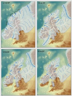
The unique maps record the pattern and speed of shrinkage of the large ice sheet that covered the British Isles during the last Ice Age, approximately 20,000 years ago. The sheet, which subsumed most of Britain, Ireland and the North Sea, had an ice volume sufficient to raise global sea level by around 2.5 metres when it melted.
The maps are based on new information on glacial landforms, such as moraines and drumlins, which were discovered using new technology such as remote sensing data that is able to image the land surface and seafloor at unprecedented resolutions. Experts combined this new information with that from fieldwork, some of it dating back to the nineteenth century, to produce the final maps of retreat.
It is also possible to use the maps to reveal exactly when land became exposed from beneath the ice and was available for colonization and use by plants, animals and humans. This provides the opportunity for viewers to pinpoint when their town/region emerged.
Professor Chris Clark, from the University of Sheffield’s Department of Geography, said: “It took us over 10 years to gather all the information in order to produce these maps, and we are delighted with the results, It is great to be able to visualize the ice sheet and notice that retreat speeds up and slows down, and it is vital of course that we learn exactly why. With such understanding we will be able to better predict ice losses in Greenland and Antarctica.


