Northwestern University researchers have turned to an unusual source—Major League Baseball—to help learn why maps used to predict shaking in future earthquakes often do poorly.
Earthquake hazard maps use assumptions about where, when, and how big future earthquakes will be to predict the level of shaking. The results are used in designing earthquake-resistant buildings. However, as the study’s lead author, earth science and statistics graduate student Edward Brooks, explains “sometimes the maps do well, and sometimes they do poorly. In particular, the shaking and thus damage in some recent large earthquakes was much larger than expected.”
Part of the problem is that seismologists have not developed ways to describe how well these maps perform. As Seth Stein, William Deering Professor of Geological Sciences explains “we need the kind of information the weather service has, where they can tell you how much confidence to have in their forecasts.”
The question is how to measure performance. Bruce Spencer, professor of statistics, explains that “it’s like asking how good a baseball player Babe Ruth was. The answer depends on how one measures performance. In many seasons Ruth led the league in both home runs and in the number of times he struck out. By one measure he did very well, and by another, very poorly. In the same way, we are using several measures to describe how hazard maps perform.”
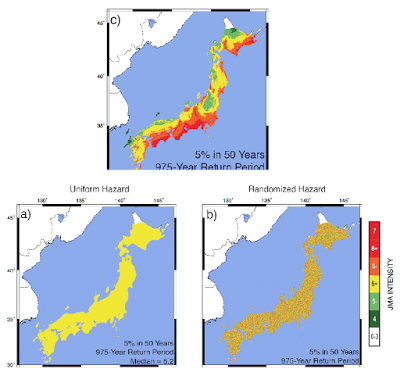
Another problem is that the hazard maps try to forecast shaking over hundreds over years, because buildings have long lifetimes. As a result, it takes a long time to tell how well a map is working. To get around this, the team looked backwards in time, using records of earthquake shaking in Japan that go back 500 years. They compared the shaking to the forecasts of the published hazard maps. They also compared the shaking to maps in which the expected shaking was the same everywhere in Japan, and maps in which the expected shaking at places was assigned at random from the published maps.
The results were surprising. In Brook’s words “it turns out that by the most commonly used measure using the uniform and randomized maps work better than the published maps. By another measure, the published maps work better.”
The message, in Stein’s view, is that seismologists need to know a lot more about how these maps work. “Some of the problem is likely to be that how earthquakes occur in space and time is more complicated that the maps assume. Until we get a better handle on this, people using earthquake hazard maps should recognize that they have large uncertainties. Brightly colored maps look good, but the earth doesn’t have to obey them and sometimes won’t.”
Note: The above post is reprinted from materials provided by Geological Society of America.


